Here’s something small that may be overlooked by a few people…the cursor that is now used in Revit 2010 for entering text. Now you could be saying to yourself, why in the heck is he writing about the cursor being different from 2009 to 2010 when entering text…well, I didn’t think anything of it until today.
I was placing some notes in a sample file and I was placing a leader along with the text. Well, this is where things started to seem a little weird. Just so we’re all on the same page, here’s what the cursors look like for each version…
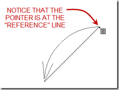
I know, big deal right. Or, finally, the text cursor looks like a text editor cursor! Well, the difference really comes in when you are using a leader before you place the text. It took me a second to realize what was going on, but it’s definitely different in 2010 than in 2009. Here’s what I mean…


As you can see, the new cursor is using a new point of reference for starting the leader and the text. Otherwise, everything else is the same as it was in 2009. Nothing major or mind blowing, but something to keep in mind when using the Text tool in 2010.


2 comments:
Thanks. Have you found a way to customize the cursor? I absolutely do NOT like it.
Unfortunately, the cursor is what it is and it can't be customized.
Post a Comment